
The Payoff from Centralizing Your Data

Before WBUR’s digital transformation, tracking their popular Valentine’s Day flower campaign meant juggling multiple spreadsheets, constant email updates, manual coordination across teams, and many late nights. Today, a single dashboard gives them real-time visibility into everything from the marketing campaign funnel to customer service issues to fulfillment logistics—all in one place.
Our blog series on WBUR’s Catapult Initiative has shared guidance and lessons learned on how to invest in digital infrastructure successfully, and in this final post of the series, we want to provide you with concrete, visual examples of what you can see and do when you have your data integrated and centralized.
The fundamental benefit of working in a centralized CRM platform is that teams reference the same data. This means from the CEO on down to individual contributors working with donors, everyone has an accurate understanding of the current status of donors, sponsors, and prospects. (An important caveat: not everyone sees everything. Data visibility can be limited with access controls.) But the impact of having accurate, unified data is the ability to align goals across teams and have universal agreement on if goals are on track. This represents a significant leap from WBUR’s previous setup, where each department maintained their own data with their own standards and processes, leading to inconsistent reporting and making cross-departmental comparisons difficult, if not impossible. In times of strained finances, having an accurate view of the financial status of an organization is critical for making swift and important decisions.
Unified data within a CRM additionally empowers team members to generate reports and snapshots easily, removing bottlenecks. For example, sponsorship team members can track their individual goals versus actual sales.
These dual benefits of data transparency and simplified reporting streamline operations. What WBUR has done goes beyond this to customized data dashboards tuned for their business. Dashboards with real-time, automated monitoring and reporting, can alert teams to both urgent issues and strategic opportunities. This level of data insights empowers organizations further.
To demonstrate how this can dramatically change the way teams can work, this post presents the details of two dashboards at WBUR, each of which have been celebrated by the teams as key “wins” for the Catapult Initiative.
Valentine's Day Fundraiser Dashboard
Every February, WBUR runs a pledge drive for Valentine’s Day flowers. Donors can order a variety of bouquets for their loved ones, to be delivered on either February 13th or 14th, in partnership with a local florist. This type of drive has a lot of logistics beyond a normal pledge drive: sending orders to the florist, communicating special requests, monitoring customer service issues, and making last-minute decisions if weather impacts the delivery of the delicate flowers.
With new systems in place, the WBUR membership team built a dashboard using their CRM’s native components to monitor all aspects of the Valentine’s Day pledge drive (excluding final delivery, carried out by the vendor). The Valentine’s Day Fundraiser dashboard became a real-time operational command center for the drive, supporting the membership team’s time-intensive work in the week before Valentine’s Day.
The screenshots below highlight the metrics the team tracks during the drive. The top-level cumulative view in Figure 1 allows all team members to monitor how the campaign is progressing toward its goals. From left to right, the dashboard shows:
- The total number of sales per bouquet type.
- The total actual revenue compared to revenue goal.
- The performance of the marketing funnel, illustrating how online traffic is arriving via each campaign channel (email, social media, search, and buttons and banners on wbur.org).
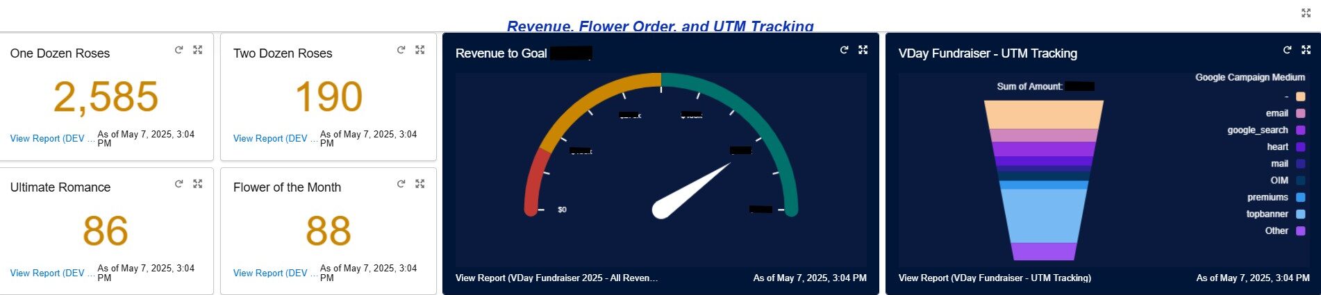
Figure 1. Screenshot of Valentine’s Day Dashboard
The dashboard also offers a view of day-by-day revenue leading up to February 14, compared to the revenue from each day of the prior year’s campaign (Figure 2). This view breaks out pledges by product type, highlighting which discount codes contributed to each day’s revenue. This view allows teams to see if revenue is tracking by day, and adjust their deployment of discount codes to boost sales.
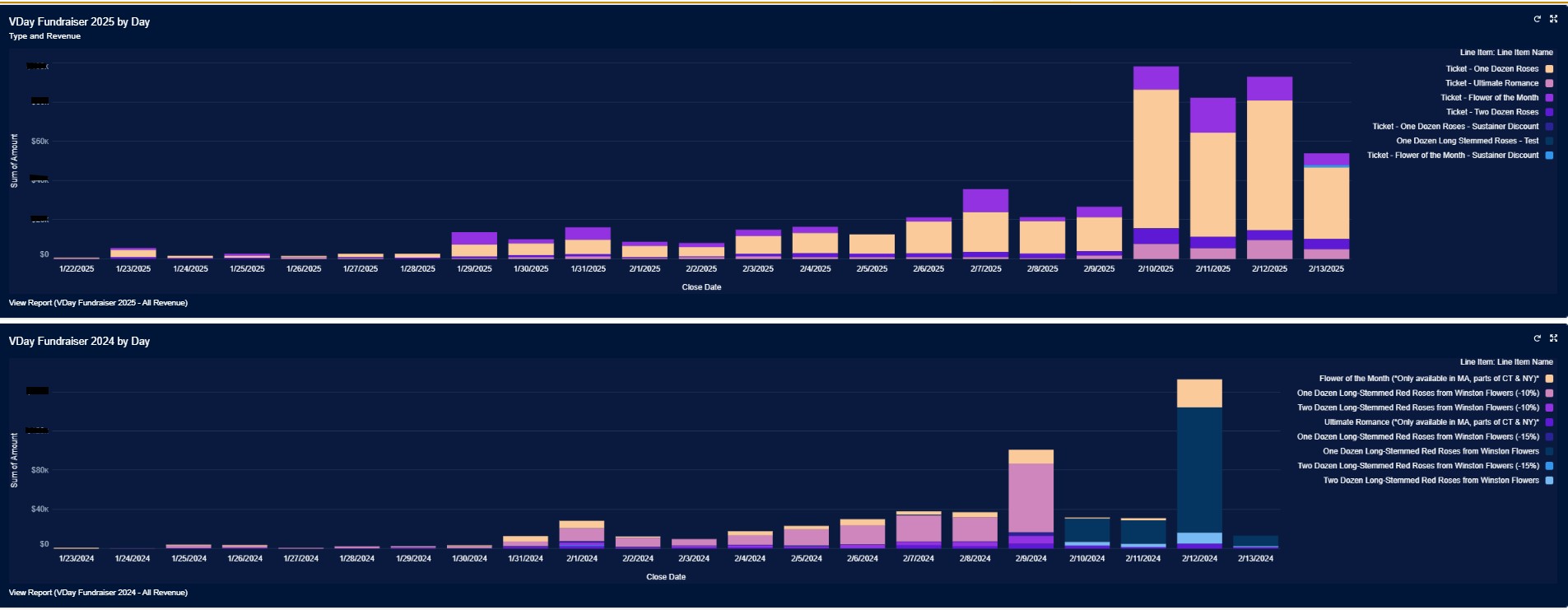
Figure 2. Comparison of revenue to previous year’s performance, day-by-day
The third major component of the dashboard is the customer service view, shown in Figure 3. The top section shows incoming customer service issues and the bottom shows which issues are currently in progress. This enables the team to jump into addressing issues as the queue grows.
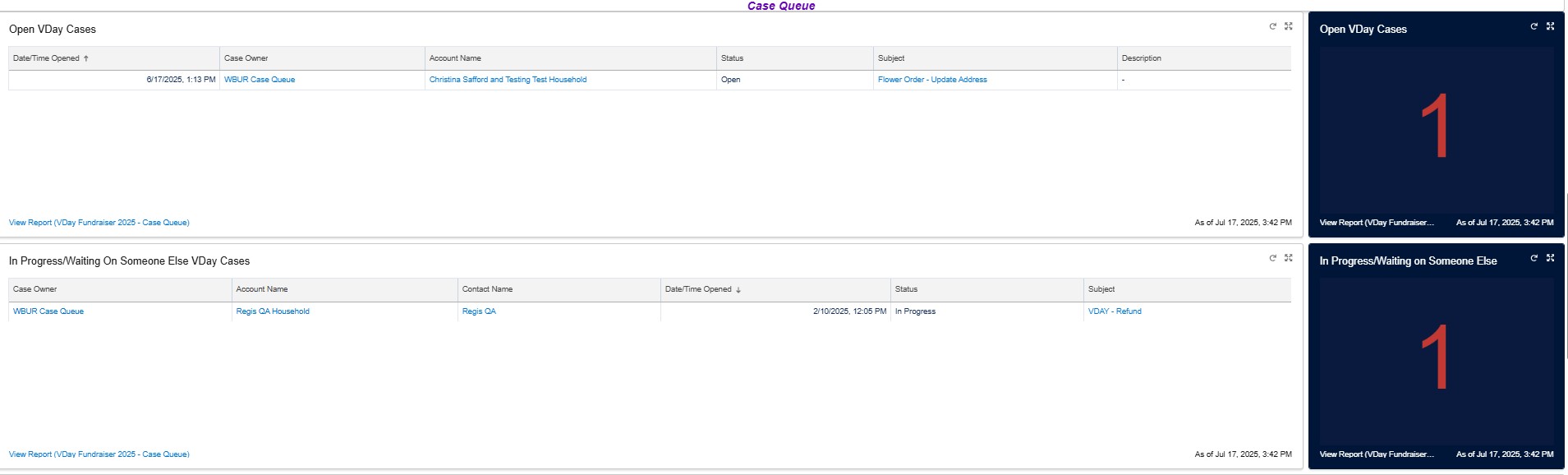
Figure 3. Customer service issues (showing just one open case, for illustration purposes only)
And to close the loop on the fulfillment process, the final screen (Figure 4) shows the orders ready for delivery, split between February 13th vs. 14th deliveries. The top left displays the number of items to ship by day. The top right is a list view with full order details including donor name, delivery date, and quantity. The lower portion of the dashboard shows orders that have issues with “Character Count errors” – these are orders where the Valentine’s Day note from the sender exceeded the maximum length. A very important error that the membership team seeks to resolve as quickly as possible.
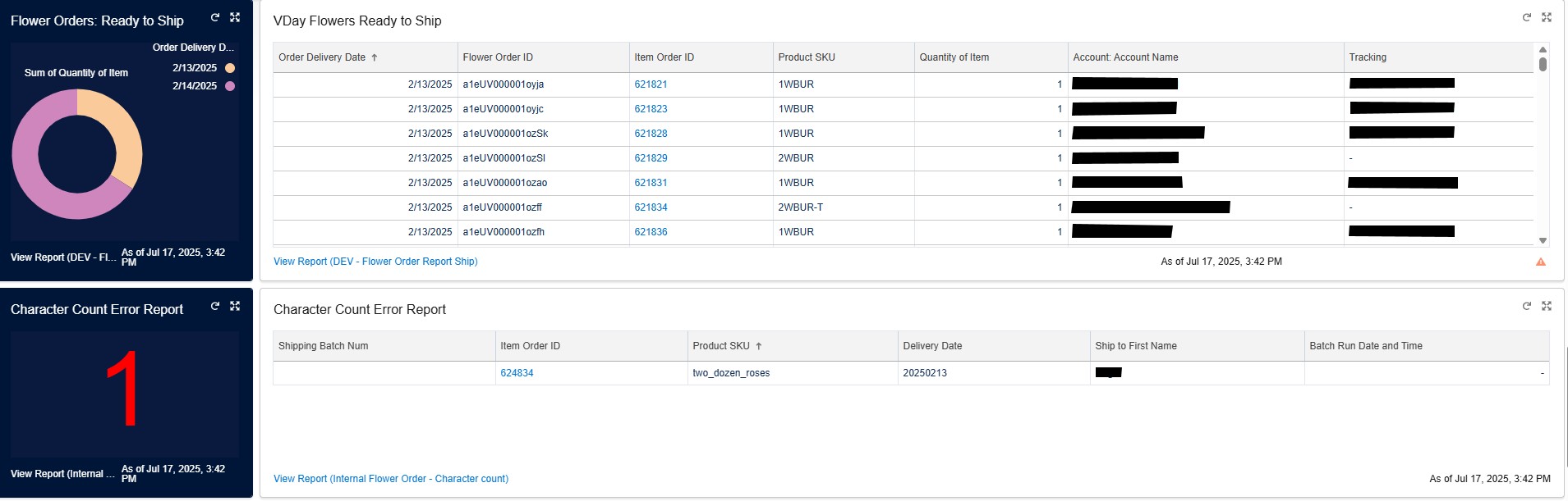
Figure 4. Flower orders ready for fulfillment
This dashboard is entirely built around the needs of the team, designed for monitoring the pledge drive from marketing campaign through to fulfillment. Having real-time visibility of the data has meant that team members know how the campaign is progressing and can monitor all aspects of customer service and pick up customer service issues quickly. Everyone can easily see which ones are a top priority across the board.
Prior to this dashboard and data integration, the Valentine’s Day campaign was largely the same but the flow of information was hindered. Different people owned different pieces of the operation, which provided clarity, but meant that each person spent time providing numerous updates to the rest of the team, off-line and via email, to keep everything moving smoothly. Now, with its new whole-team approach and real-time visibility, the drive now runs more efficiently and easily, eliminating late nights and missed customer service issues resulting in lost donors (and lost bouquets) – major wins enabled by their digital transformation.
Business on the Books Dashboard
WBUR’s second dashboard example addresses a different but equally important challenge: tracking sponsorship revenue against goals.
While the WBUR’s infrastructure investment merged most of WBUR’s data into an integrated solution, not all systems could be centralized. This is often the case: some legacy systems are essential to keep and too costly to fully integrate with new systems. And this was the case with WBUR’s trafficking and invoicing system for underwriting and sponsorship sales – this platform continues to be used for fulfillment and billing and is not integrated with the new CRM, which tracks sales leads, activity and opportunities (the sales pipeline).
Because the CRM and trafficking systems were not integrated and WBUR’s business partnerships team needed to see both booked and projected business in a singular view, the organization utilized a business intelligence platform to export data out of the two systems and integrate data into a single view, for sales managers and executives. This dashboard came to be referred to as the Business on the Books dashboard (the BoB).
Similar to the Valentine’s Day Fundraiser dashboard, the BoB was built to support a specific team’s need to track both tactical and strategic goals. In this case, to track both projected and booked revenue, by individual salesperson, by account, by product and in aggregate.
The dashboard has two views: a top-level view for monitoring sales against goals and a detailed view for drilling into individual sales and account executive activity, again benchmarked against goals. Figure 5 shows the top-level view, charting WBUR’s budget, year-over-year forecasting, and actual booked business. Like many organizations, revenue is earned in seasonal patterns, so a critical component is comparing monthly revenue to the same time period a year prior.
Prior to the BoB, the leadership team would review static spreadsheets that had been compiled manually over many hours, and occasionally had some misreported numbers. Weekly syncing of data and a dynamic, integrated view has changed this significantly. This dashboard is now viewed weekly by the executive leadership team.
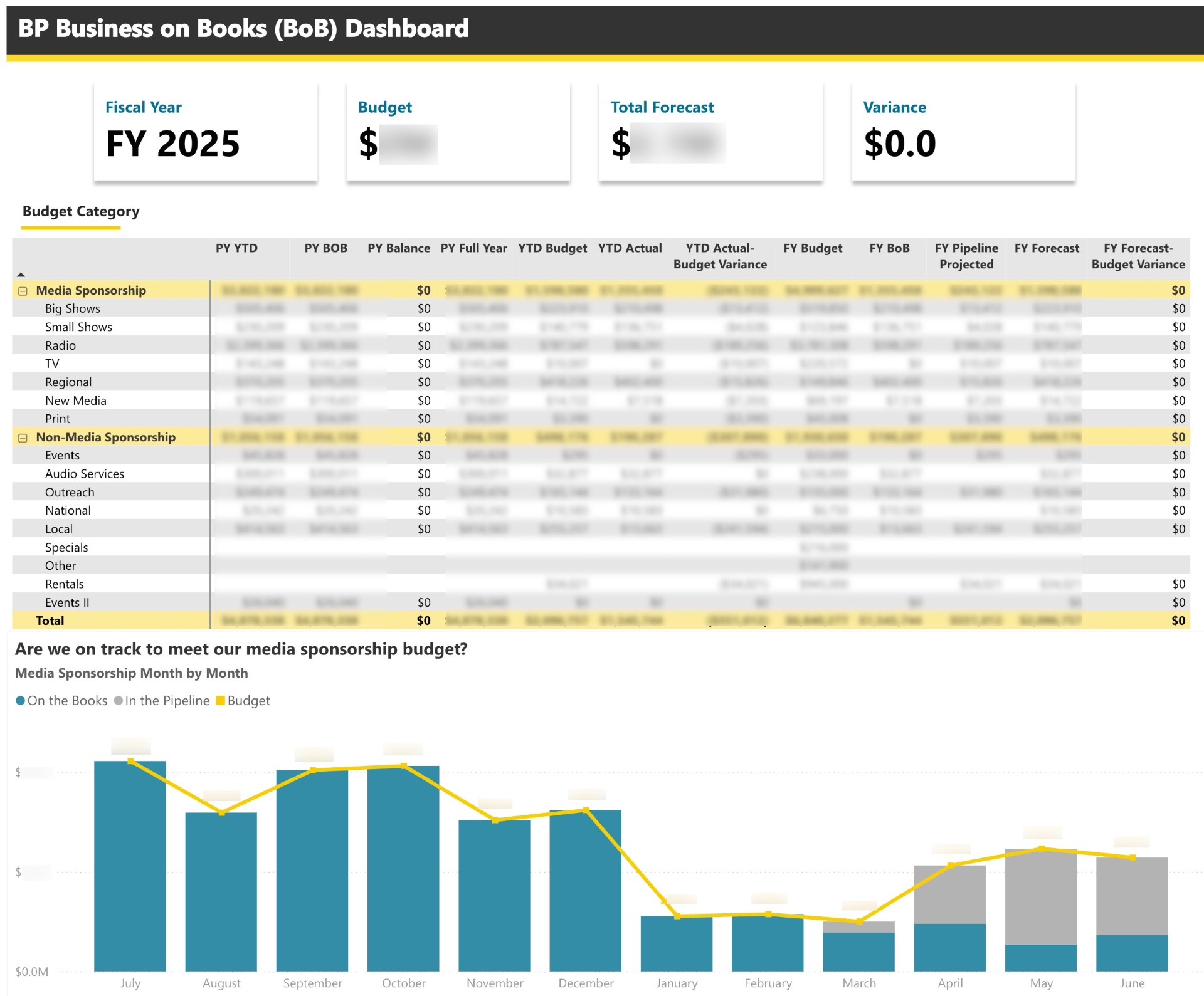
Figure 5. Business on the Books: top level view of current revenue
The second view is more detailed (Figure 6), showing revenue “In the Pipeline” versus “On the Books.” The projected forecast model provided by the CRM allows this view to include projected business which has been adjusted for confidence, and a total combined revenue forecast. This combined outlook is a new capability for the organization, and with it shared in a dashboard, salespeople and leaders can track the same numbers. This view can show business partnerships’ performance holistically, or by each individual sales person.
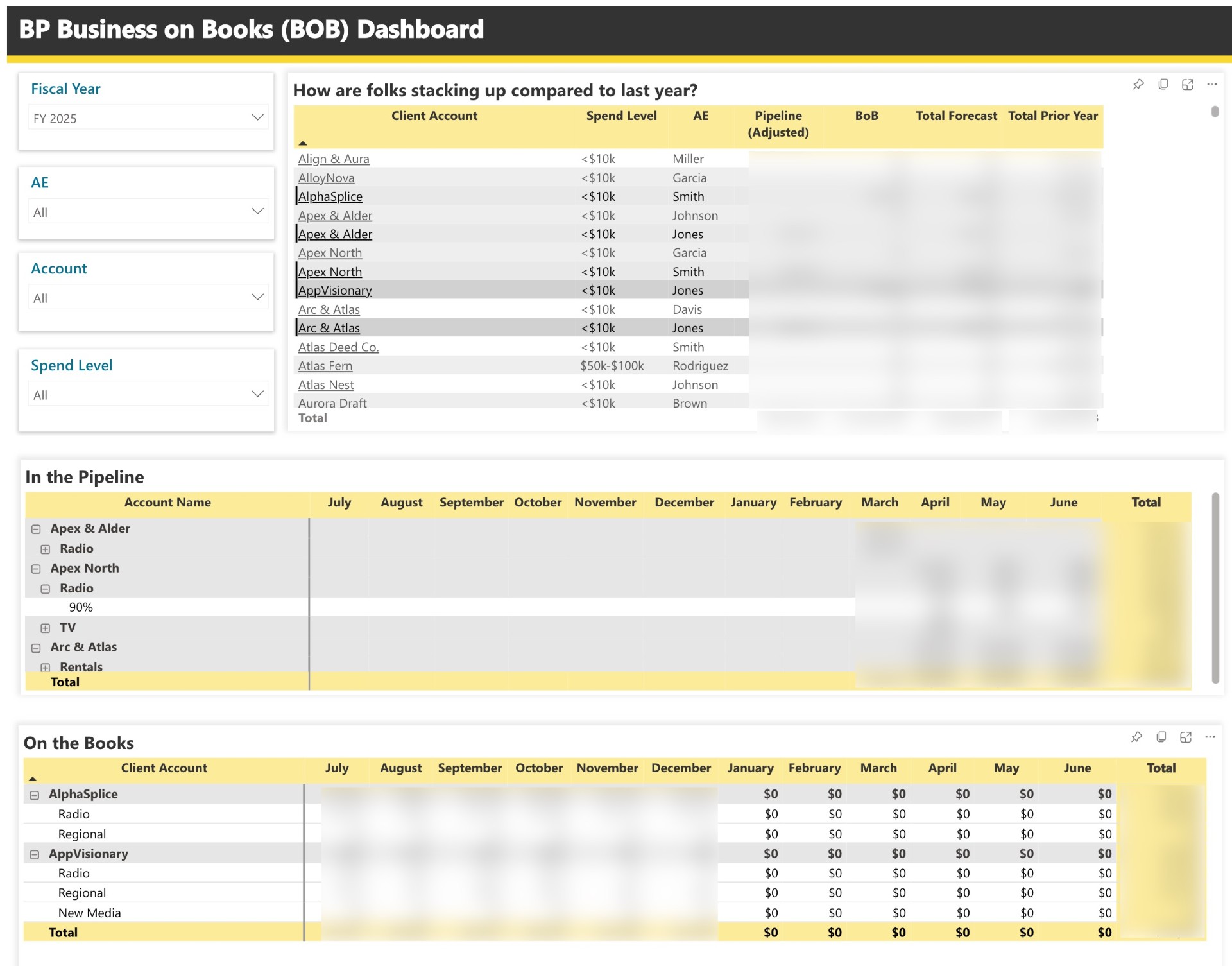
Figure 6. Business on the Books: detailed view of In the Pipeline vs. On the Books
This dashboard has changed how the business partnerships team operates: every week, a manager reviews with each account executive the revenue booked versus in the pipeline, looking at details such as what the projected businesses have booked in the past, and what they had booked at the same time last year. They also can examine details on new leads and what stage each pitch is in, to explore untapped opportunities to move a client through the sales pipeline. A key technical detail is that, while this dashboard is not hosted within the CRM, every drill down in the dashboard is a direct link to the account listing within the CRM, so while reviewing the report, teams can directly link to the details and make changes to the data in the CRM.
Before this dashboard, there was no easy way to get a comprehensive view of business partnerships revenue, and after many years of manually merging spreadsheets, the team was frustrated that the systems were not automatically integrated when the CRM launched. Therefore the custom built Business on the Books dashboard, integrating contracted revenue and the sales pipeline was a victory for financial reporting and forecasting at WBUR. All of this has led to many more sales leads being entered into the system, and has enabled the team to track and move leads through the sales funnel more quickly. The team is optimistic that the higher volume of sales leads, with dashboard tracking, will generate a significant increase in sponsorship revenue.
Building Dashboards: What It Really Takes
WBUR’s dashboards illustrate an enormous leap forward, but getting them in place was much more complex than “simply building” them. Returning to our initial point that data sharing and simple reporting are the precursors to creating custom dashboards, there are several fundamental business processes and structures we recommend to ensure you can progress through these steps to get to dashboards.
Know the Data You Have
First, understand what data you have. New platforms hold the promise of powerful insights and capabilities, but they can only deliver on that promise if you have the data and it is structured such that you can access it. This fundamental requirement can be easily overlooked amid the excitement of new reporting capabilities.
Before you can create dashboards, you must first understand what data you have and how your data needs to be modeled in the system to be effective for building your dashboards. For example, in the BoB dashboard, the need for month-by-month revenue, with a look back to the same month the year prior, was a critical component of revenue tracking, which informed which data was extracted and put into the dashboard. For the Valentine’s Day Fundraiser dashboard, the teams needed to utilize tracking codes on each marketing campaign (email, social media, web, etc.), so that the success of each marketing channel could be tracked and graphed in the dashboard. After you have identified a need for reporting, plan out how you will collect and store this data, so that it is accessible for reporting.
Clean Your Data Early and Often
The dashboards are only as accurate as the data in them. Your data needs to be accurate to provide accurate reporting. While this point sounds obvious, it is critical to have business processes in place to ensure your data is clean when it is entered into the CRM and is maintained with a high level of integrity. The team at WBUR emphatically agrees that keeping data clean and maintained is an ongoing process, not a one-time clean up. Duplicate entries, miscategorized accounts, and misspelled details compound over time to undermine your need for insights.
When errors in your data appear, you need a process for flagging the issue and identifying the source of the error: a faulty setting? an automation? a bad bulk import? or a one-off human input error? Tracing the issue to the source and documenting how to prevent it from continuing is essential.
To manage data integrity, WBUR made some important organizational changes: They centralized data management to the CRM administrators and established data ownership among the business leaders on revenue teams. Additionally, both the fundraising team and the business partnerships team host monthly reviews of the data, as a team, to flag issues. This has meant that teams are able to improve the quality of the data over time and develop consistent approaches to data entry.
Data Skills
While new tools and systems are important, the human element remains critical. WBUR recommends investing in a data expert on your staff, even if you don’t plan on investing in a new CRM platform. WBUR’s ability to leverage their data underscores the importance of having the right expertise on staff to customize these tools and build extensions effectively. Having individuals focused on data management, analysis, and data strategy allows for your organization to plan out a strategy for data integrity, reporting, and dashboards that can be built over time, to support your leadership’s goals. Whether you hire a data analyst or support a team member in expanding their skills, having someone with data analysis skills and familiarity with your business needs is critical for accelerating your use of data.
Practical Guidance for Your Organization
Based on WBUR’s experience, before building dashboards, there are three steps to building a strong data foundation:
- Understand the data you have
- Prioritize maintaining data integrity
- Invest in your data expertise
The team’s final point is: Don’t wait for perfect data to begin using it more effectively. Build from what you have, not what you wish you had. Always focus on the highest-value data points first by discussing priority with your revenue teams. Which new data reporting will have the biggest impact on revenue?
Organizations that invest in building a strong data foundation now will be better positioned to adapt to changing audience needs, identify new revenue opportunities, and fulfill their public service mission in the years ahead.
Check out other posts in our series exploring lessons from WBUR’s comprehensive digital transformation:


This work has been made possible through a grant from the John S. and James L. Knight Foundation.
Contributors to this blog post

Author
More on the blog
Latest Articles


Disciplines
Popular Tags
Sustainers New Audiences Mid-Level Giving Leadership Donor Acknowledgement Digital Fundraising FCC Industry Categories Donor Cultivation Event Sponsorship Halo EffectRelated Member Content
View these related member resources and more with a Greater Public membership: